Case Study
User Experience at Decker Library
My position at the Maryland Institute College of Art (MICA) oversees the library’s digital presence. In 2017, I undertook a complete information architecture redesign project, which was done just before the institution implemented a website redesign.
Decker Library website prior to information architecture redesign project (2015).
Decker Library homepage after information architecture redesign and after the MICA website migrated to a new CMS.
Project Phases
Phase I: Understanding the existing information architecture.
There were several things all staff could agree on regarding the information architecture of our website:
It was not clear where certain pages lived.
There were too many pages.
Many pages were outdated.
In order to gain a better understanding of our existing information architecture, I developed a content inventory and site map.
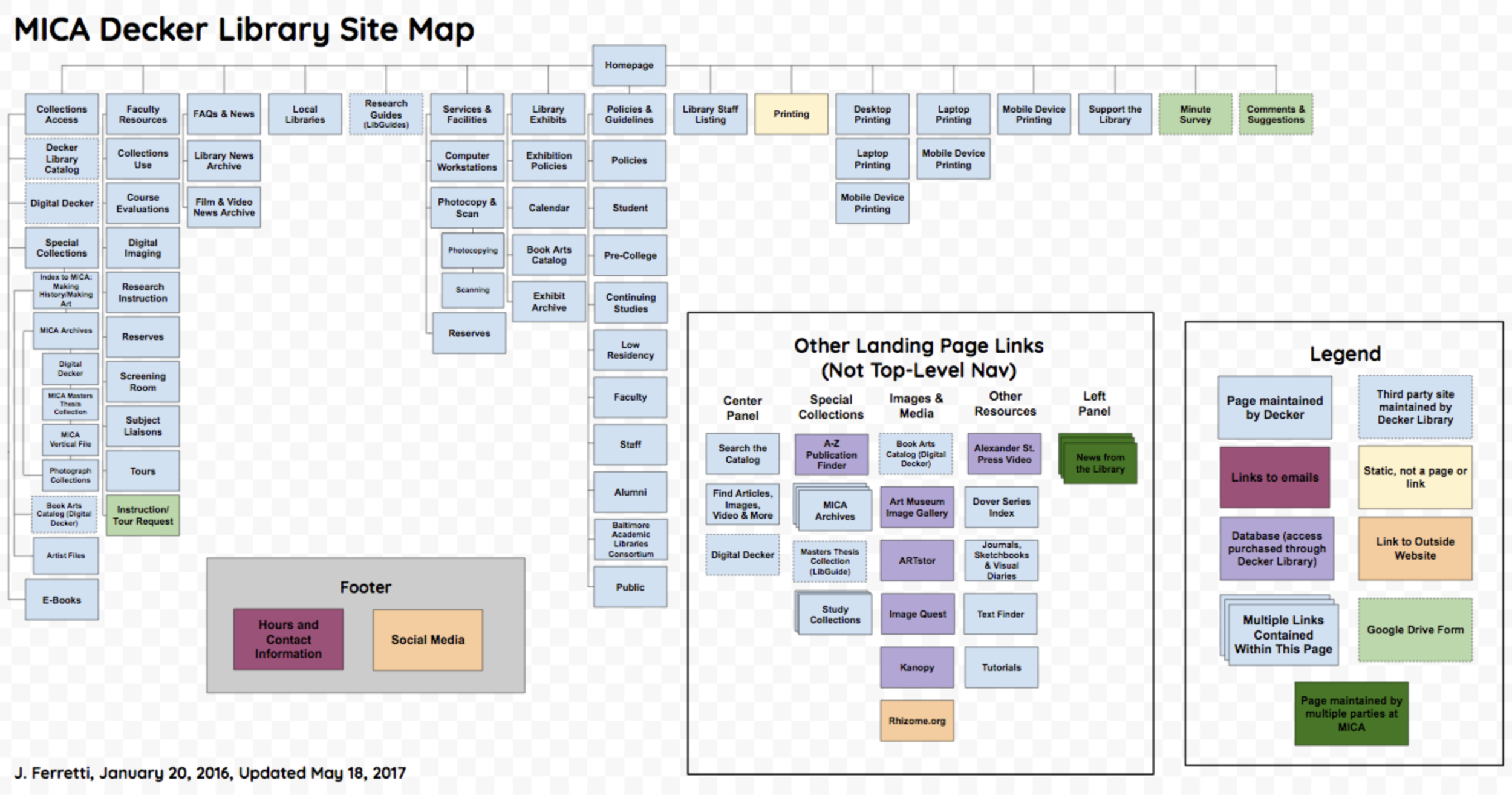
Site map, 2017
The site map revealed a fairly lopsided architecture with many types of pages. This visualization also helped all staff realize how the website was hindering our ability to disseminate information clearly to our users.
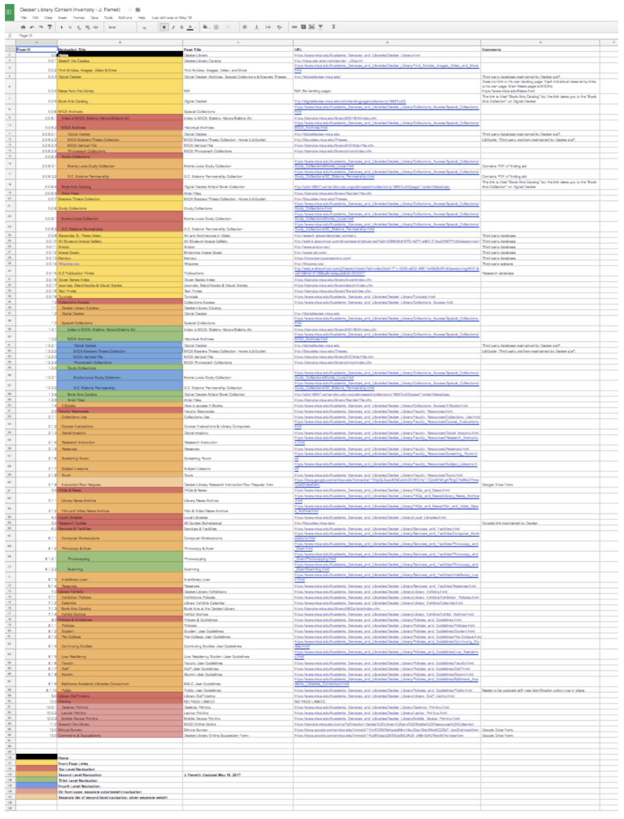
Content Inventory, 2017
The content inventory was lengthy and revealed several layers of information. Some areas contained four levels of navigation.
Decker Library homepage, 2015.
Phase II: Research and user testing.
The information architecture redesign was initially presented to the library’s Web Task Force, a short-termed group who were tasked to kick off redesign. Members were asked to read articles on basic design and usability and developed a list of library websites we felt were successful in user experience and design. We developed a list of common features we liked:
Large search bar
White/negative space
Discovery services
Multiple access points (drop down menus, direct links in footer)
Banner image
After the initial task force researched and noted library websites, I chose to focus on two library websites to guide our information architecture redesign:
University of Dayton Libraries
University of Wisconsin-Madison Libraries
Keeping our VIP library website list short was essential. Through these methods, we moved into our own user testing.
Closed card sort, 2017.
To help us evaluate the information architecture of our website, we conducted a closed, manual card sort with students, staff, and faculty. The initial top-level navigation categories were determined by the Web Task Force.
Proposed Site Map
After research and user testing, a proposed site map was drafted. Note the amount of yellow boxes, which are coded to indicate new pages. Our previous website had many more pages, but obviously did not provide enough information.
Phase III: Site copy and reorganization.
After the proposed site map was complete, each area of the library was responsible for managing copy for particular sections of the library’s website. These areas included:
Access Services
Archives & Special Collections
Exhibitions
Research Instruction
We reviewed page title and language, as well as any immediate areas of need.
Developing and retrieving copy, 2018.
Each category (top-level navigation) is one Google Doc. Subpages have been added to the Google Doc as a heading. Each section was assigned to a staff person and I served as copy editor.
Phase IV: Implementation
After all sections had copy, staff from MICA’s Strategic Communications office created each page listed on the new site map and I populated them with content. As mentioned earlier, the institution also underwent a web redesign project, so in addition to new information architecture, we also had a new front end design and Content Management System to work with. The new CMS has been an incredible improvement, not only for ease of use, but also because it came with it power and agency to make changes in real time, which is critical to our functioning as a library.
Where we started: Original site map from pre-2017.
Where we landed: Redesign of 2018.
Decker Library website prior to information architecture redesign project (2015).
Decker Library homepage after information architecture redesign and after the MICA website migrated to a new CMS.


